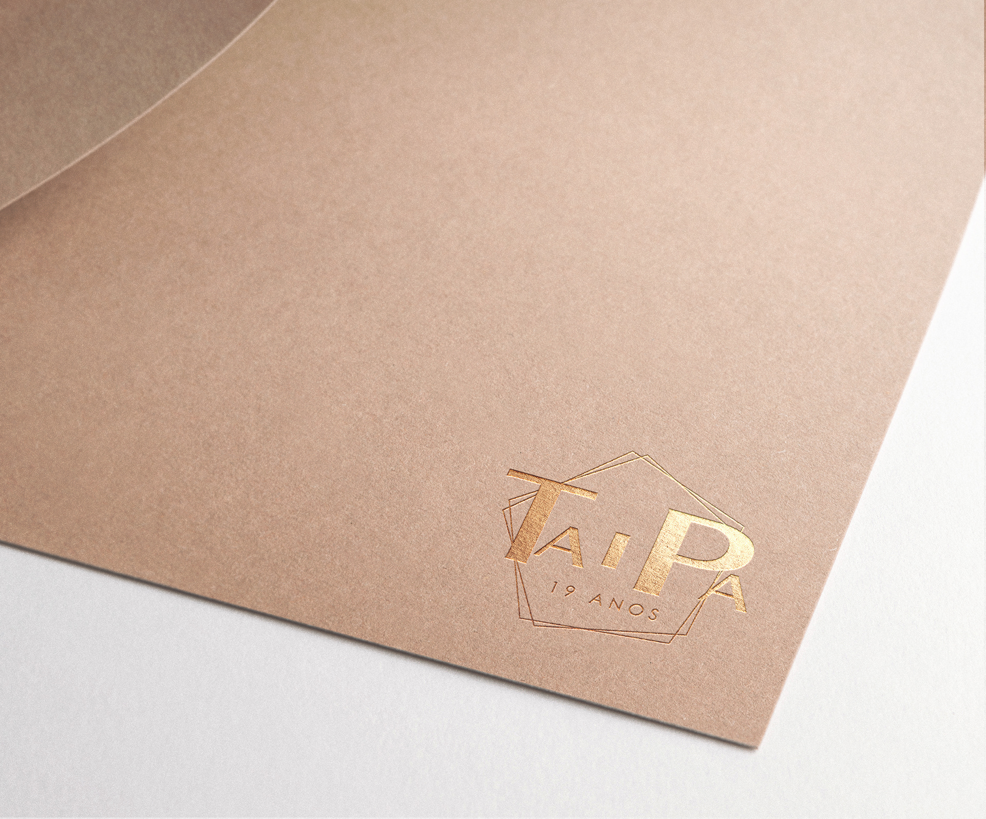
TAIPA, a cooperative organization for the integrated development of the municipality of odemira, emerged in 2000 with the perspective that “things are born because they are lacking” in the territory, people and institutions. This collective solution is intended to be a realizing arm of development, having as members a group of collective entities representing the most varied sectors and individual representatives of civil society in Odemira.
In 2019, 19 years of its existence were celebrated and I was able to have the honor of developing a special edition of its logo to celebrate this achievement. The only mandatory requirement was that the typographic construction of its name was maintained in order to maintain its identity. In addition to this composition, I intended to create something that would demonstrate the its spirit, but that in its whole result would be quite minimalistic. Thus, two pentagons were combined in which the total number of sides represents the current number of projects under development by TAIPA. This Pentagonic form had yet another meaning, it resembles a house, Taipa's house. The innovative spirit of the whole team is unique and it ends up becoming a family. The element indicating the number of the celebratory years was also added. Its application in gold was intended to represent this entity with more refinement, in a unique way and show more its entrepreneur side.

TAIPA, CRL 2019
-
Thank you for watching